Invoicely SaaS Template
Client
Invoicely
Industry
FinTech, Fiscal Automation, SaaS, Digital Commerce
Headquarters
Global
Services
Product Landing Page, Conversion Architecture, Design System, Framer Development
{/}
About the Project
The invoice compliance burden in Brazil is one of the most complex in the world: Notas Fiscais, tax classification, emission rules, integration across a fragmented marketplace ecosystem. Invoicely was solving a real, painful problem. What they needed wasn't just a website — they needed a conversion machine that could explain a complex product instantly and turn skeptical first-time visitors into subscribers before the second scroll.
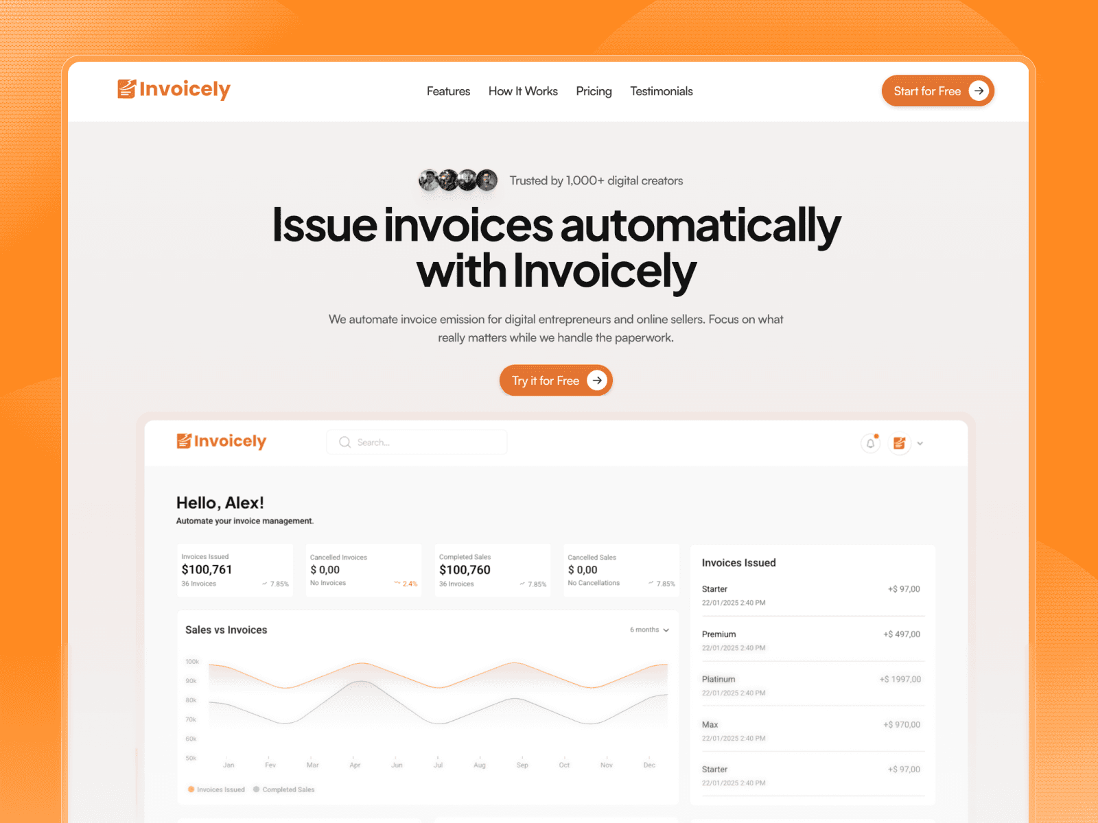
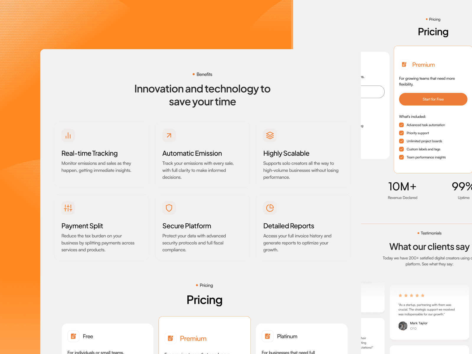
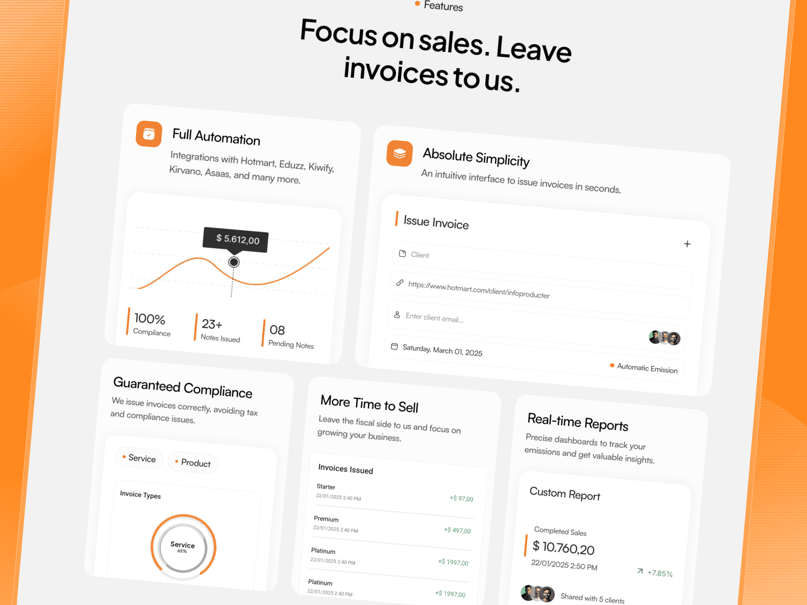
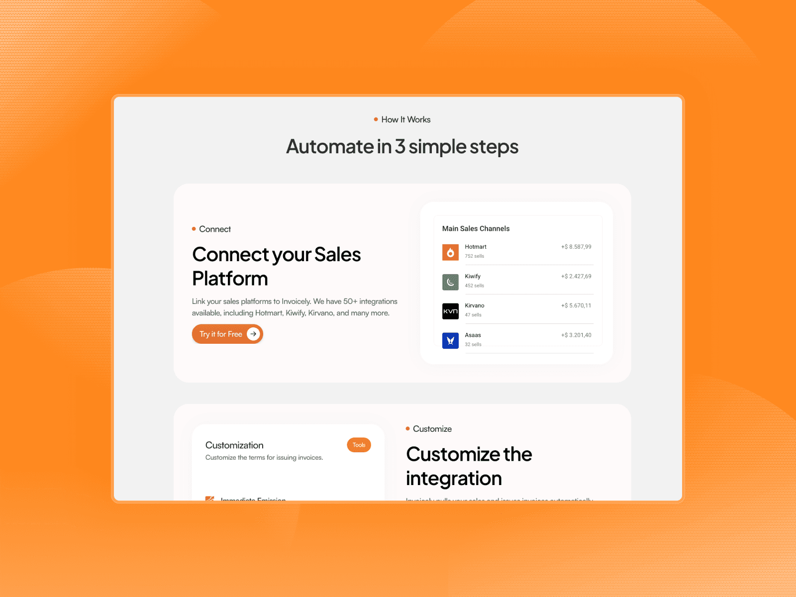
GG Studio accepted the challenge. Applying the GG Studio Methodology® across all four stages — Discovery, Architecture & UX, Design System & UI, and ongoing Support — the team engineered a landing page built around a single conversion thesis: show the product working before you ask for a click. The result is a high-density SaaS landing page featuring an animated dashboard hero, a step-by-step automation flow, a feature grid with live UI previews, and a frictionless pricing section — all optimized for Framer with a 95+ performance score and sub-3-second load time.
The relationship didn't end at launch. Invoicely retained GG Studio for continuous iteration, optimizing conversion touchpoints as the user base scales.
{/}
GG Studio Methodology®
Discovery for Invoicely began with a deep audit of the Brazilian fiscal automation market — mapping how competitors communicate a technically dense product to a non-technical buyer. The information architecture was engineered around one question: what does a digital entrepreneur need to believe in 8 seconds? The answer: that this works, that it integrates with what they already use, and that it's simpler than their current process. The UI phase deployed a dark-mode design system with live dashboard UI components baked directly into the hero — not mockups, not screenshots, but interactive-feeling product previews that demonstrate the product while the page loads. At launch, Invoicely's team was fully equipped to manage CMS content, adjust pricing, and run A/B experiments independently — no agency dependency, no bottleneck.
{/}
Most agencies said impossible. We said: let's go!
Digital entrepreneurs were losing revenue to fiscal complexity — and losing trust to a generic product page.
Invoicely's existing presence failed to communicate the product's depth to its most skeptical buyer: the infoproductor already burned by manual invoice processes and half-built integrations. The stakes were real — every visitor who left unconvinced was a monthly recurring subscription lost. A technically superior product was being undersold by a surface-level presentation that didn't show the machine working.
A conversion-first SaaS page that sells the product by showing the product.
GG Studio deployed the full Sprint Design methodology to architect and build a Framer landing page where every section does conversion work. The hero renders a live-feeling dashboard with real invoice data. The features section uses scrollable UI previews instead of text bullets. The integration marquee leads with platform logos the buyer already trusts. The result: a page that earns credibility in 8 seconds and converts in 30.
{/}
Project Challenges
Invoicely operates in one of the most compliance-heavy categories in Brazilian SaaS — fiscal automation — where the buyer is simultaneously skeptical of tech promises and desperate for a real solution. Executing a conversion-grade page for this audience required more than design skill; it required product fluency.
Translate fiscal complexity into a message a non-accountant buys in under 8 seconds
Design a hero section that communicates the product's full feature set without overwhelming or losing the visitor
Engineer animated dashboard UI components in Framer that feel native and load without performance penalty
Build a visual integration story across 50+ platforms without the section becoming a logo graveyard
Structure a pricing section that converts free-trial skeptics while communicating compliance credibility
Deliver a fully responsive system that performs equally on mobile — where most Brazilian digital entrepreneurs browse
Most agencies would have built a template and called it a day. We built a product demo disguised as a landing page.
{/}
Results
Invoicely launched with infrastructure that could carry its growth from early adopter to category leader. The platform's landing page became its most effective sales asset — a page that pre-sells the product before the first demo call, reduces objections before they're raised, and establishes fiscal compliance credibility in an industry where trust is the primary purchase barrier. With a 95+ Lighthouse performance score, sub-3-second load time, and zero downtime at launch, the technical foundation matched the visual ambition. The ongoing retainer ensures that as Invoicely scales its user base, the page scales with it.
+
Lighthouse performance score post-optimization — the technical standard a premium product demands from its page
days
Full delivery from zero — no prior site, no existing brand assets, live in under one week
<
s
Page load time, delivering a fast-first experience for CMO-level buyers comparing options in real time
%
Cheaper. The core competitive argument, made undeniable by a single comparison section — $30 vs. $70, more credits, one dashboard